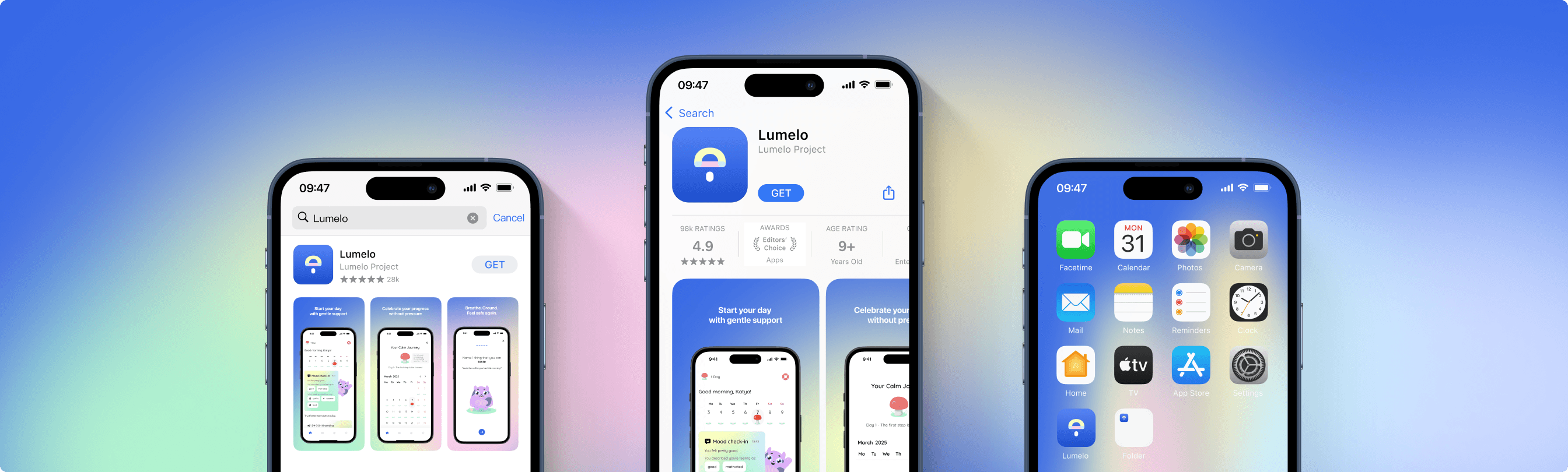
Lumelo: Finding calm at your own pace.
The Problem
Globally, anxiety disorders affect 264 million people. In Germany alone, 15% of adults suffer from anxiety—yet the path to help is full of roadblocks. My quantitative research identified massive access barriers:
- Long wait times for therapists and high financial costs.
- Social stigma surrounding mental health support.
- A striking 60% of surveyed users had no current access to therapy.
Currently, users are stuck between two flawed extremes:
- Meditation Apps: Beautiful and calming, but lacking deep therapeutic tools like Cognitive Behavioral Therapy.
- Clinical Apps: Effective, but often feel cold, medical, and intimidating.
The Challenge
How might we design an app that provides clinical-grade coping mechanisms without the clinical pressure?
The Solution
Lumelo bridges the gap by translating Cognitive Behavioral Therapy (CBT) and mindfulness into a pressure-free, emotionally accessible interface.

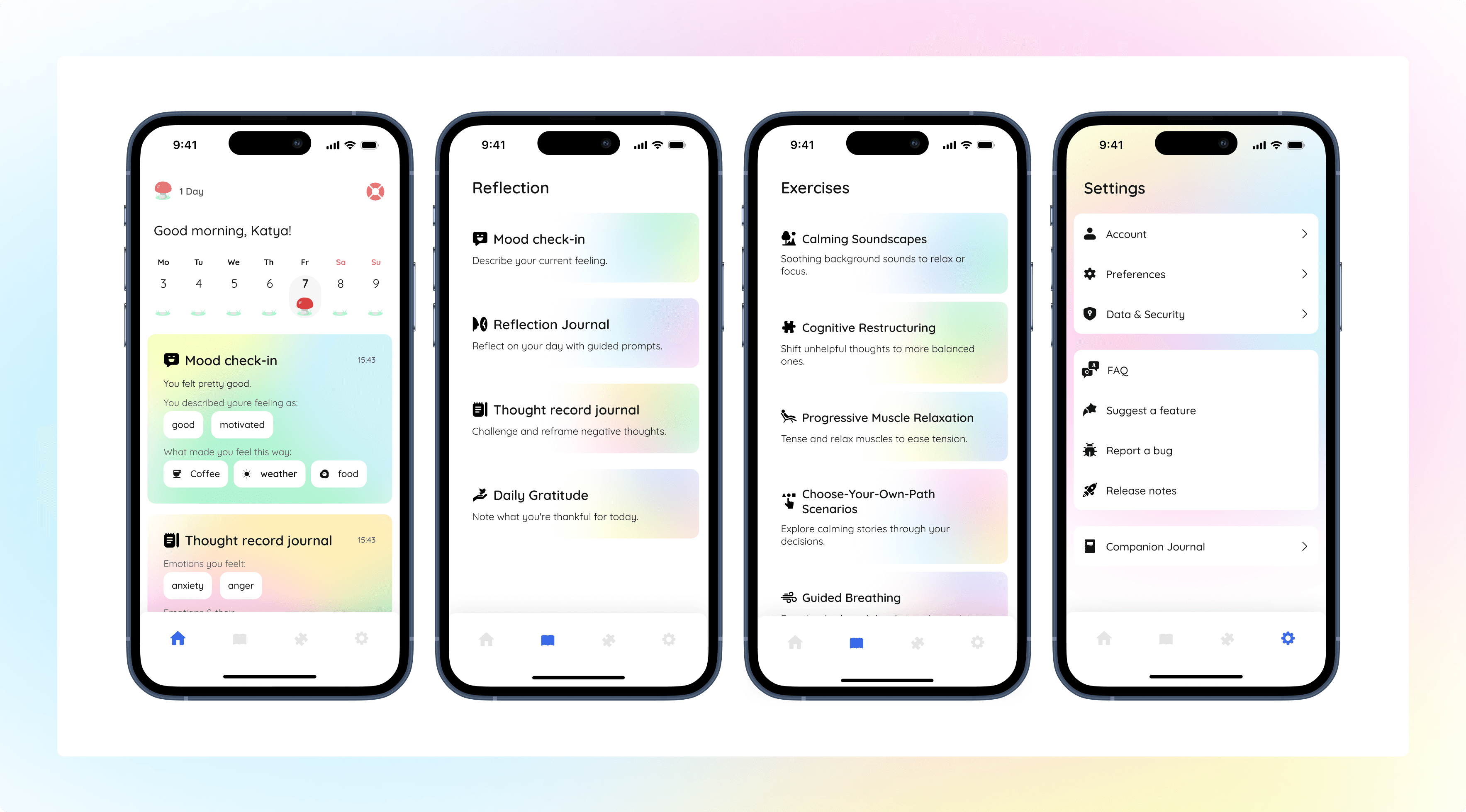
The 7 Companions: To create emotional safety and continuity, users are matched with one of seven animated companions. A personalized onboarding algorithm assigns the perfect guide based on the user's emotional needs (e.g., assigning a soothing, motivating, or grounding character).

The Analog Extension: Recognizing that screens can sometimes exacerbate anxiety, Lumelo includes an integrated feature to seamlessly order a physical A5 companion journal for tactile, offline reflection.
Core Features
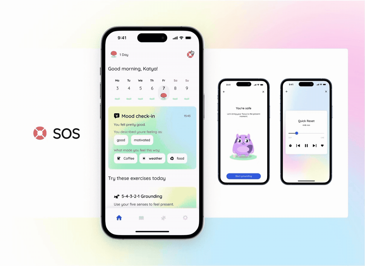
Contextual Emergency Aid (SOS)
A highly visible SOS mode designed specifically for the cognitive overload of a panic attack, offering quick resets, contact shortcuts, and grounding tools.
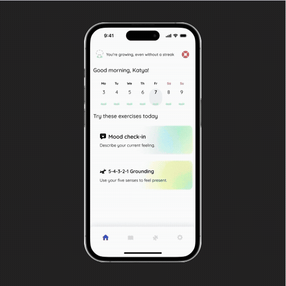
Mindful Gamification
High-anxiety "fire streaks" are replaced with a growing mushroom. This rewards quiet consistency without punishing users for missed days, emphasizing that healing is not always linear.

The 11-Tool Ecosystem
A comprehensive library clearly divided into "Reflection" (Mood Check-ins, Thought Record Journals) and "Exercises" (Guided Breathing, Progressive Muscle Relaxation).

Concept Evolution
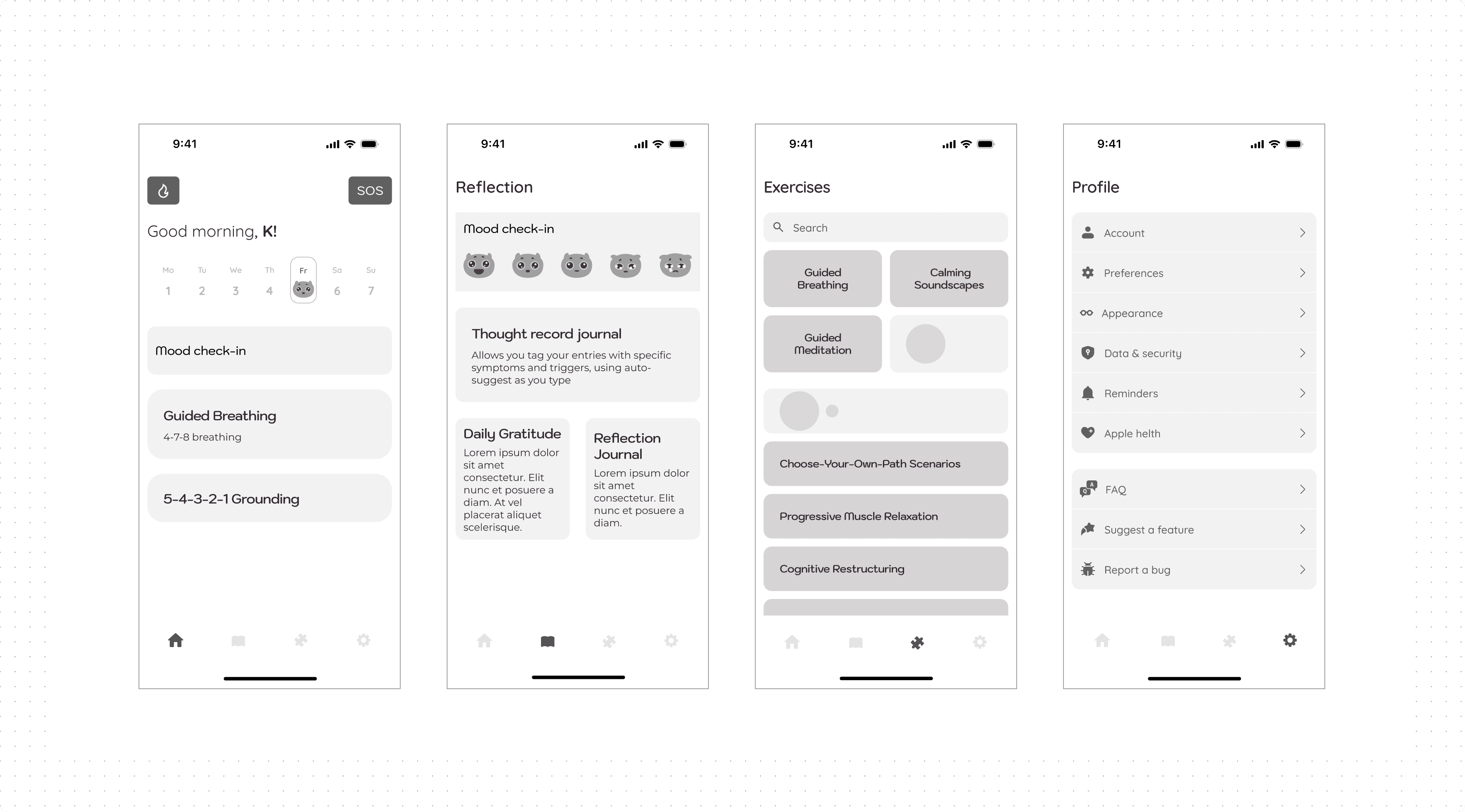
Structure & Usability Testing
Early architecture maps and wireframes underwent low-fidelity user testing. Feedback directly highlighted a need for optimized touch targets, clearer hierarchy, and more visual breathing room, guiding the layout refinement.


Visual & Brand Iteration
The visual identity evolved from abstract corporate branding and stark sketches toward an approachable, friendly aesthetic. The final mascot and logo were designed specifically to evoke a supportive companion rather than a clinical tool.


Design System

Colors for Emotional Safety
A palette of soft pastels and gradients was chosen to intentionally avoid sensory overload and the sterile, "medical" feel of traditional health apps.

Typography
Quicksand was selected for its clean, rounded terminals, enhancing the friendly and approachable aesthetic throughout the app.

Inclusive & Accessible
The UI features large, easily tappable buttons for moments of physical unrest, and an automatic Dark Mode to ensure a calm, eye-friendly experience in any environment.
The Execution
Interactive Prototyping: The concept was brought to life as a clickable prototype and tested extensively with the target audience.
User Feedback & Pivots: Testers responded overwhelmingly positively to the lack of performance pressure and the non-clinical tone. Based on this qualitative feedback, I refined the visual clarity of the streak system, adjusted text sizing for better readability, and optimized icon placement.