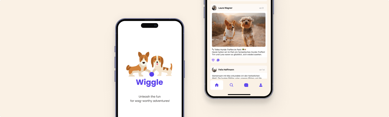
Wiggle: Connecting Dogs and Their Humans.
Every dog owner knows the feeling: standing at the park, hoping your dog finds a friend to play with — but often facing the same old problem. Socialization happens randomly, too often, too seldom, or inconsistently. As a pair of friends — a product manager, a developer, and me — Wiggle was the first multi-role digital project that actually let us dive in and own the direction. Our goal was to build a space that lets dog owners find, connect, and meet other owners and their furry friends.
Research & Discovery
Before sketching a single screen, we needed to understand the entire landscape. We started by mapping topics and clusters — clearly identifying what would make people switch from their existing habits. After mining app store reviews, Reddit threads, and comparable tools, two themes emerged: people wanted easy discovery and genuine social connection. We captured these insights through affinity mapping and group sessions.


User Empathy
To ground our design decisions we stepped into the shoes of our users. We built a storyboard for a fictional user, tracing her journey from an Instagram ad to her first walk with another dog owner. A detailed service design map then traced every touchpoint and emotion across six stages — Awareness, Research, Consideration, Download, Usage, and Support.


Information Architecture
With user flows documented, the next challenge was organising the app's information hierarchy. Wiggle's structure revolves around four core areas: creating an account, searching for other users, a live chat, and a personal profile. We kept navigation flat and focused, reducing cognitive load for first-time users while surfacing advanced options for returning ones.

Prototyping & Testing
We started with paper sketches and low-fidelity wireframes to validate the basic layout. Once the structure was established, we ran usability sessions targeting three core flows: finding a match, initiating contact, and setting up a walking session. User feedback directly informed which features moved forward and how interaction patterns evolved.


Visual Design
Wiggle needed to feel approachable, energetic, and trustworthy. The colour palette reflects the joy of dog ownership — warm and playful, while still passing colour-blindness and contrast accessibility checks. Typography was chosen to balance friendliness with legibility across all screen sizes.

The Final Solution
The final result is a cohesive social mobile app that brings dog-play playdates to your pocket.
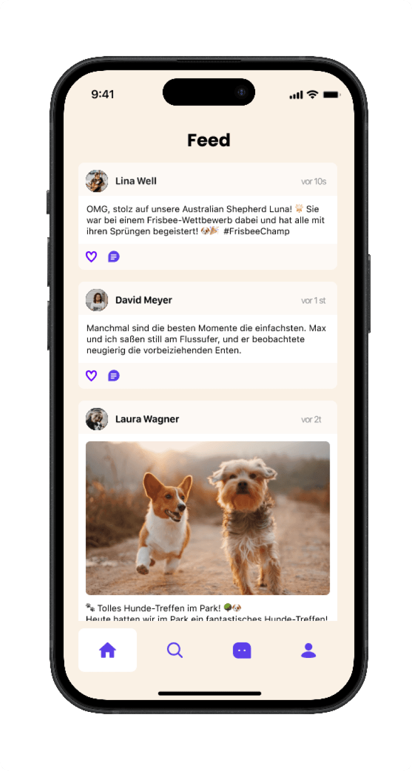
The Home Feed
A curated feed of posts from owners and their dogs. Get to know the community around you before making a connection.
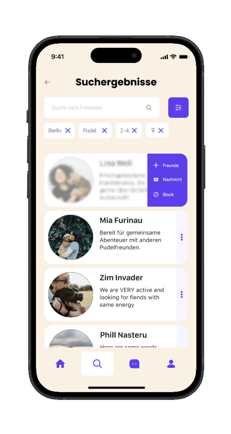
Tailored Search
A powerful filter tailored to finding exactly what you're looking for — by breed, location, and dog age.
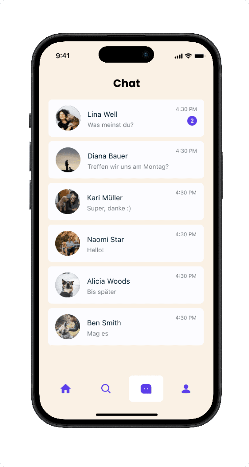
Seamless Connection
No formality, just friends. Reach out, plan a walk, and let your dogs do the rest.
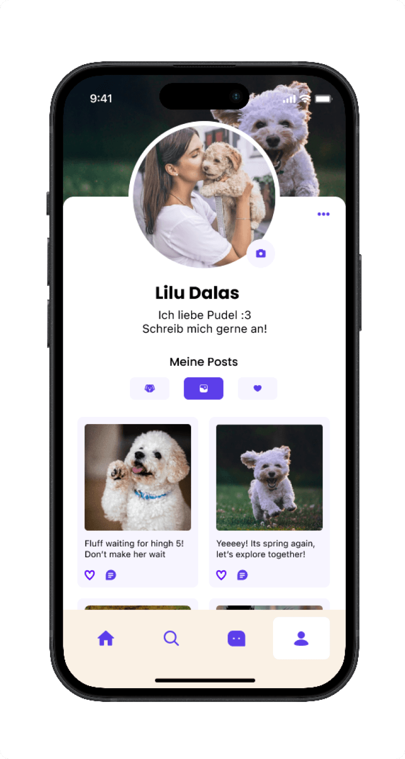
Profiles & Routes
A detailed profile to showcase your pup's breed, age, and personality. Build trust before the first meeting.
Retrospective
Wiggle was my first collaborative product design project within a multi-disciplinary team. Working alongside a product manager and developer taught me to design with real constraints from day one.